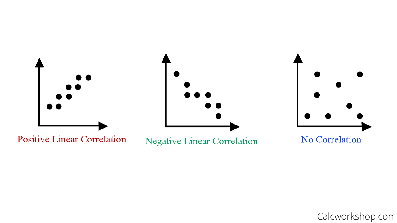
Did you know that the Line of Best Fit is the same thing as the Trend Line or the Line of Regression?

Jenn, Founder Calcworkshop®, 15+ Years Experience (Licensed & Certified Teacher)
Yep!
In fact, when we represent data in the form of a scatter plot, we are able to see how one variable affects the other. And when data follows a similar pattern, this relationship is called correlation.
We represent this correlation by using trend lines or best fit lines that help us to approximate a set of data points.
In fact, the process for finding the line of best fit is super easy!
First, we must construct a scatter plot from the given data and understand correlation.

Understanding Positive Correlation and Negative Correlation
Next, we sketch the line that appears to most closely follow the correlation. Don’t just choose the first and last data points, but construct a line that best represents the trend. Most likely, you are looking for the median values, and this is why sometimes the trend line is also called the median fit line.
Then we find two points that appear to be on the regression line and calculate the slope.
Finally, we use Point Slope Form to write the linear equation that represents the line of best fit.

Trend Line Example
Now invariably, when dealing with sample data, not every data point will be on our line of best fit. Consequently, there will be points above and below our line. This error in our prediction is called a residual and it is the vertical distance between a data point and the regression line. While we won’t be analyzing residuals in this lesson, as they dealt with in Linear Algebra when studying least squares, it is important to know what they are and do our best to minimize our residual values when creating our best fit line by hand.
Furthermore, when creating scatter plots and best fit lines by hand there could be several possible “good” answers. Your answer will be correct as long as your line of regression nicely follows the sample data according to the observed correlation and your calculations are correct for the two sample points you choose, as Math Bits nicely states. Otherwise, if you want an accurate line of best fit, you will need to use a graphing calculator or computer.
Together we will look at how to recognize correlation for various scatter plots and determine whether the relationship is linear or nonlinear such as quadratic, cubic, exponential, or logarithmic.
Then we will follow the steps for creating best-fit lines for various sample data and use our regression lines to approximate or predict future values. This technique is also referred to as linear approximation.
Line of Best Fit (How-To) – Video
Get access to all the courses and over 450 HD videos with your subscription
Monthly and Yearly Plans Available
Still wondering if CalcWorkshop is right for you?
Take a Tour and find out how a membership can take the struggle out of learning math.