How do you begin to analyze and make sense of a set of data?

Jenn, Founder Calcworkshop®, 15+ Years Experience (Licensed & Certified Teacher)
By employing measures of central tendency.
The measure of central tendency, as accurately stated by Laerd Statistics, is a single value that attempts to describe a set of data by identifying the center within that data set.
So, how do you measure central tendency?
There are three primary ways to measure central tendency: mean, median, and mode.

Notation used for the Sample and Population Mean
The mean is nothing more than the average, whereas the median is the number directly in the middle of the data set and the mode represents the value that occurs most often.
The range describes the difference between the greatest and least values in our set of data, which is found by subtracting the biggest and smallest numbers.
There are several ways we can arrange or organize our sample data. We can use a Frequency Distribution table or a Line Plot, which helps us to indicate how often a term occurs in the data set. We will look at both of these methods of representing our sample data.
The Stem and Leaf Plot is a systematic way of arranging our data values by creating a table where each data value is split into a “stem,” typically the tens digit, and the “leaf,” the ones digit, as Math is Fun nicely states, this table helps us to determine groups of values the data falls easily.
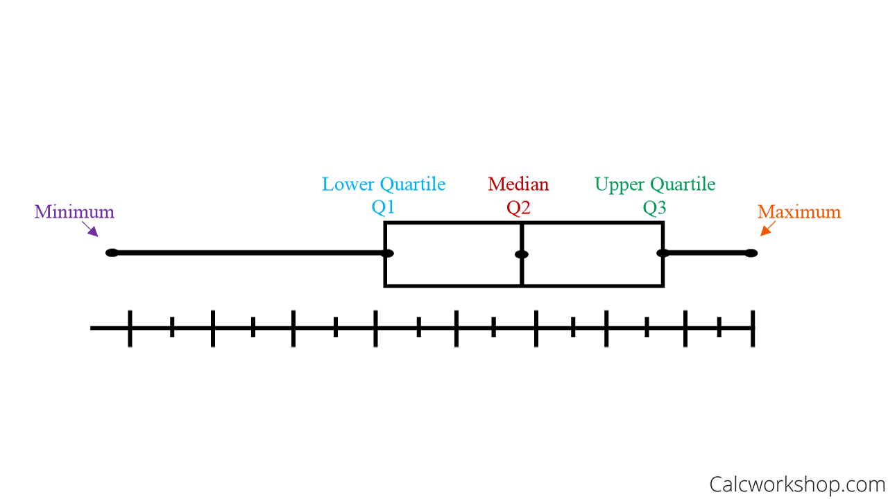
But the Box and Whisker Plot is one of the most classic tools for presenting data, as it indicates the maximum, minimum, median and quartile values for a sample set.

Representing Data in a Box-and-Whisker Plot
How do we create a box and whisker plot?
We start by organizing our data in ascending order (least to greatest) and finding the median. We refer to this median value as the 2nd Quartile.
Next, we will find the median for the lower quartile or the median of the numbers that fall to the left of the sample median. This value is called the 1st quartile.
Then we will find the median of the upper quartile, or the middle number for the values that fall to the right of the overall median. This number is called the 3rd Quartile.
And finally, we place Quartile 1, Quartile 2 (median), and Quartile 3, along with the maximum and minimum values on our line graph and create a box with whiskers. It’s really quite clever and helps us to clearly see the four regions that our data falls into.
Two other statistical methods that we use to measure the distribution of data are Percentiles and the Mean Absolute Deviation.
Have you ever taken a standardized test and been told you feel within a certain percentile?
So what are percentiles?

Formula for finding the Mean Absolute Deviation
Well, in the case of a standardized test, a percentile indicates the value at or below which a percentage of data falls; and gives you a good picture of how well you did in comparison to everyone else that took the same test. And together we will look at how to find percentiles for a given set of data.
Finally, we will look at calculating the Mean Absolute Deviation (MAD).
The mean absolute deviation calculates the average distance between each data value and the arithmetic mean, and it helps us to see the deviation or how “spread out” the values in a data set are.
By the end of the lesson, you will have a solid foundation for the fundamentals of statistical analysis.
Central Tendency Measures (How-To) – Video
Get access to all the courses and over 450 HD videos with your subscription
Monthly and Yearly Plans Available
Still wondering if CalcWorkshop is right for you?
Take a Tour and find out how a membership can take the struggle out of learning math.