What’s the difference between Qualitative (Categorical) Data and Quantitative (Numerical) Data?

Jenn, Founder Calcworkshop®, 15+ Years Experience (Licensed & Certified Teacher)
In our previous lesson on categorical data, we learned that qualitative data represents those values or variables that describe some characteristic or category.
For example, if I were to ask you what is your favorite color? what is your favorite season? what is your gender? or what is your education level? notice that your response is descriptive and not numerical. This helps to tell you that we are dealing with qualitative, or categorical data.
Now, quantitative data are data that take on numerical values, and that is why quantitative data is also referred to as numerical data.
For example, suppose I were to ask you your height, age, grade point average, or the the amount of time you study each day, I would be asking you to identify a numerical or countable value or variable. The number you say for each question to height, age, etc., are numerical and therefore quantitative.
And there are two critical characteristics of quantitative data that help us to further classify observations: discrete quantitative data and continuous quantitative data.
Discrete data is countable, like age or number of years of education, whereas continuous data allows for decimal values such as height and weight.
Okay, so now that we know the difference between qualitative and quantitative data, did you know that there are five graphical ways we can represent quantitative information?
- Dot Plots
- Stem and Leaf Plots
- Cumulative Frequency Plots
- Histograms
- Box and Whisker Plots (Box plots)
As you may recall, from our previous lesson, a distribution tells us all the possible values of the data and how often they occur. In essence, a distribution allows us to perform data analysis, more commonly referred to as statistical analysis, such as averages and percentiles.
A quantitative distribution is typically ordered from the smallest count to largest count and represented in one of the five graphical methods listed above so we can eventually examine the shape, center, and spread of the data.
This video lesson will examine the first four graphical methods for quantitative data and leave box plots for our next lesson when we learn how to measure the center of data.
Quantitative Data Examples
Okay, so let’s walk through each type with examples.
Imagine we collected the following data sample: { 24 , 13 , 24 , 20 , 11 , 24 , 13 , 20 , 24, 13 }
Dot Plot
Now, a dot plot, sometimes called a line plot, is a simple way to organize data and is considered a simple version of a bar graph or histogram. It is best for smaller data sets and is easy to read and interpret. You start by drawing a horizontal line, placing the frequencies for each measurement above as a dot. In other words, each dot represents a value in our distribution or data set.
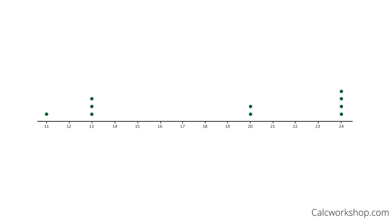
Dot Plot Graph
Bar Graph
Look how nicely we can take our dot-plot and turn it into a frequency table and bar graph.
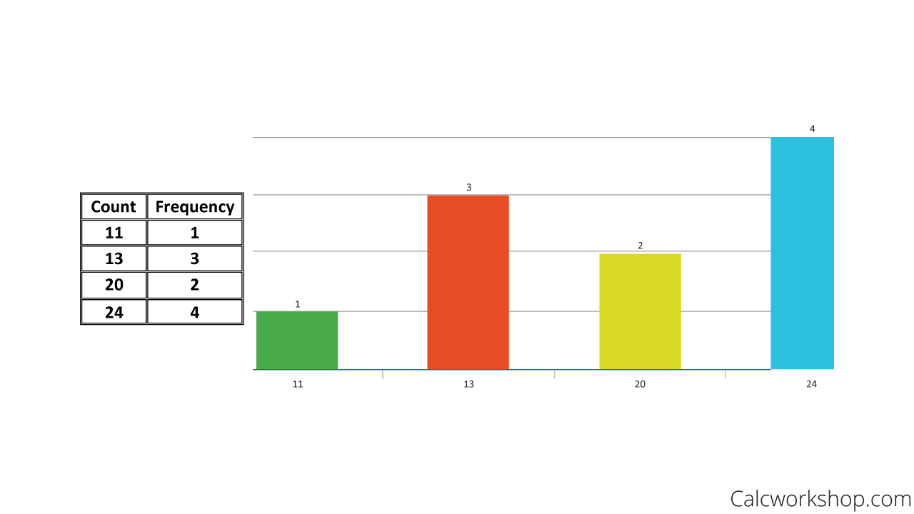
Frequency Bar Graph
Stem And Leaf Plot
But now, let’s look at how we can take our sample data and display our results using a stem-and-leaf plot.
A stem and leaf plot, also called a stem plot, is also great for small sets of data, and nicely shows the shape of a distribution. We organize a stem plot by splitting our data values into two parts, the stem, and the leaf. For example, let’s take the number 46. The stem is the 4, and the leaf is the 6.
We will list the stems vertically, and the leaves horizontally. If we use our current example of { 24, 13, 24, 20, 11, 24, 13, 20, 24, 13 } we will represent our data set in a stem plot as follows:
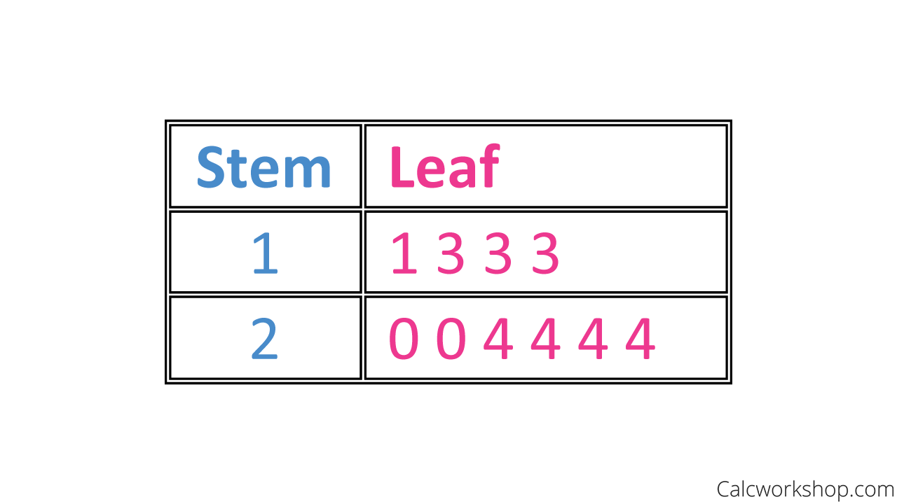
Stem And Leaf Plot
But notice that there are only two stems, which doesn’t give us a good idea of the spread or shape of the distribution. So we will have to employ a technique called split-stems.
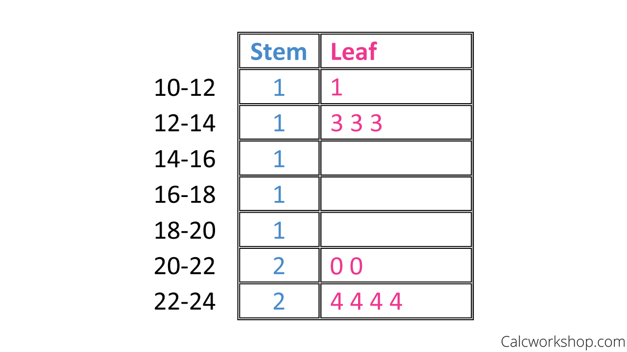
Split Stem And Leaf Plot
This means that we will split our stems by two or five, so the data split evenly. Here’s a big hint… a good stem plot has at least 5 stems!
Cumulative Frequency Graph
Now let’s look at how a cumulative frequency plot. A cumulative frequency graph is always increasing and displays the cumulative frequency of the dataset. Please note, that while similar, a cumulative frequency graph is different than a cumulative relative frequency graph, which we will look at in a future lesson.
For example, let’s use the following dataset:{ 24 , 13 , 24 , 20 , 11 , 24 , 13 , 20 , 24, 13 }
First, we need to create a frequency table, then determine our cumulative frequency.
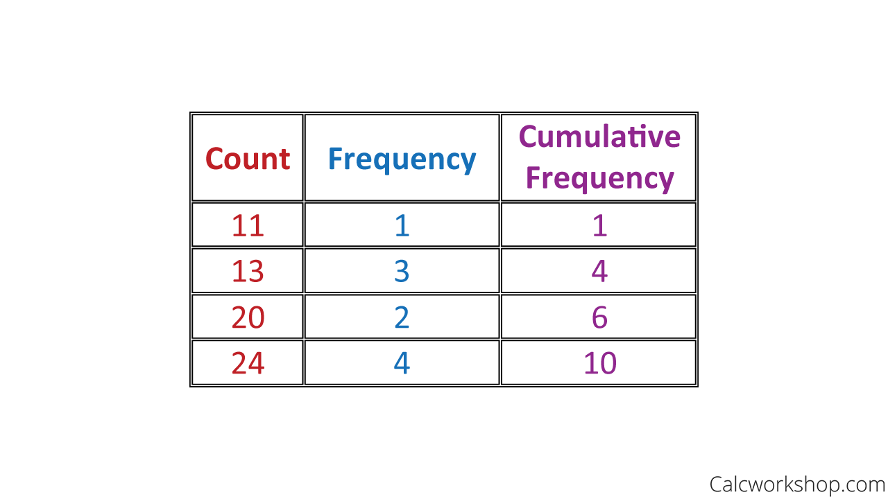
Cumulative Frequency Table
Next, we draw a graph where the x-axis represents the counts and the y-axis represent the cumulative relative frequency, plot our points, and connect the dots with straight lines, as seen below:
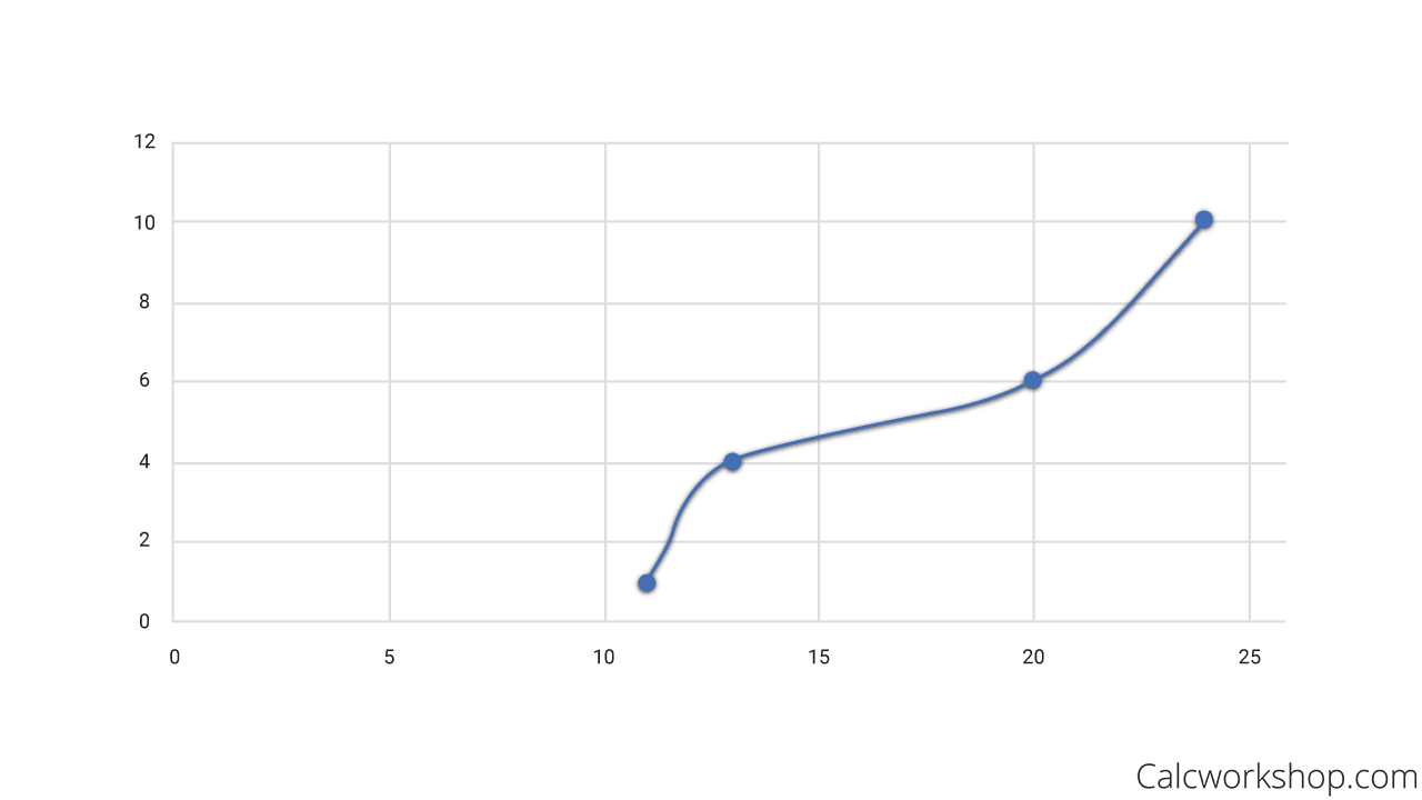
Cumulative Frequency Graph
Histogram
And now it’s time to look at the most common, and quite frankly, the most flexible of distribution graphs, as it is excellent for both small and large data sets and easy to create – the Histogram!
While it doesn’t display individual data, like dot plots or stem plots, it is fantastic in the sense that it shows the shape of the distribution.
Histogram Vs Bar Graph
Please note that a histogram is very similar to a bar graph. A bar graph displays each category’s counts, where the height of the bar indicates the frequency for that category. A histogram shows the same information, but we refer to the bars as “bins.”
More importantly, the bins display the frequency counts for a specified interval or range. Hence, another significant difference between a bar graph and histograms is that the “bars” never touch for a bar graph, but in a histogram, the “bins” do touch and are evenly spaced.
So using our data from above, { 1, 1, 1, 1, 1, 3, 3, 3, 3, 3, 5, 5, 5, 5, 5, 5, 7, 11, 11, 11, 11, 11, 11, 11, 11 }, we first have to create a frequency table.
Now, all we have to do is create a range or interval for our bins, and we are ready to develop our histogram. As the histograms below nicely indicate, our fixed width is the range between counts, but in our video lesson, we will see that we can also pick a fixed width that surrounds each count.
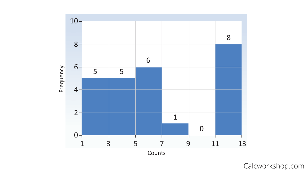
Histogram
Distribution Characteristics
And lastly, we will begin to look at how we can describe a distribution by identifying the following characteristics:
- Center – What’s the mean, median, and mode for the distribution?
- Spread – How far apart are the data values? What is the range?
- Clusters – Are the data bunched or grouped around a value?
- Gaps – Are there intervals for which there are no data?
- Outliers – Are there values unusually different from the rest?
- Shape – Symmetric, skewed right, or skewed left? Are there one or more peaks seen in the distribution?
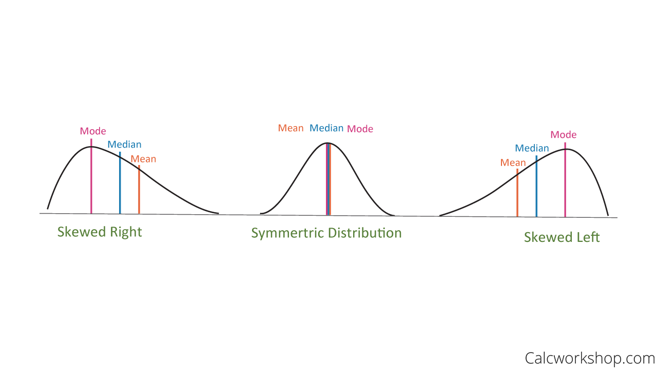
Normal Vs Skewed Distribution
It may seem like a lot to remember, but we’re going to develop a fun acronym to keep everything straight! And we will continually review and practice describe distributions for all future lessons as well.
Throughout this lesson, we will work through countless examples in detail to ensure that we can display quantitative data and also look for distinguishing features about each data set.
Quantitative Data – Lesson & Examples (Video)
1 hr 12 min
- Introduction to Video: Displaying Quantitative Data
- 00:00:36 – Overview of Univariate, Bivariate, Multivariate Data and Dot plots with Examples #1-2
- Exclusive Content for Members Only
- 00:08:06 – Creating Stem-and-Leaf Plots with Examples #3-5
- 00:19:47 – Create a back-to-back stem plot (Example #6)
- 00:27:21 – Overview of how to create a Histogram using frequencies, relative frequencies and cumulative frequencies (Example #7)
- 00:40:18 – Create a histogram given the data set (Examples #8-9)
- 00:47:27 – Graphically display of a distribution important features, acronym, and understanding skewed distributions
- 00:56:29 – Describe the distribution (Examples #10-13)
- Practice Problems with Step-by-Step Solutions
- Chapter Tests with Video Solutions
Get access to all the courses and over 450 HD videos with your subscription
Monthly and Yearly Plans Available
Still wondering if CalcWorkshop is right for you?
Take a Tour and find out how a membership can take the struggle out of learning math.