How do you find cumulative frequency?
Jenn, Founder Calcworkshop®, 15+ Years Experience (Licensed & Certified Teacher)
And how do you describe the shape, spread, and center of a distribution?
That’s what we’re going to find out today!
Let’s go!
What’s the difference between the following graphs?
- Cumulative Frequency
- Cumulative Relative Frequency
A cumulative frequency graph shows the total number of values that fall below the upper boundary of each variable. All this means is that it represents the running-total of frequencies.
Now the cumulative relative frequency graphs, also called Ogive graphs (pronounced “oh-jive”), are for percentiles and show what percent of the data is below a particular value. In other words, an Ogive graph displays the cumulative percent from left to right.
Worked Example
For example, let’s use the following dataset: { 1, 1, 1, 1, 1, 3, 3, 3, 3, 3, 5, 5, 5, 5, 5, 5, 7, 11, 11, 11, 11, 11, 11, 11, 11 }
First, we need to create a frequency table, then we need to find the cumulative frequency as well as our cumulative relative frequency (percent).
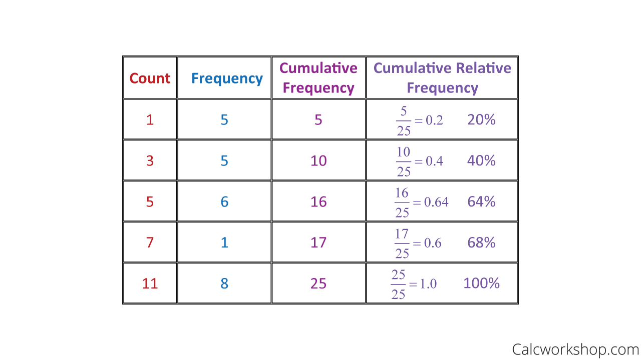
Cumulative Relative Frequency Table
Next, we draw a graph where the x-axis represents the counts, and the y-axis represents the cumulative relative frequency as noted by Statistics Canada. Then we plot our points coordinating to the cumulative relative frequency value at the left endpoint of each interval, and then connect the dots with straight lines, as seen below:
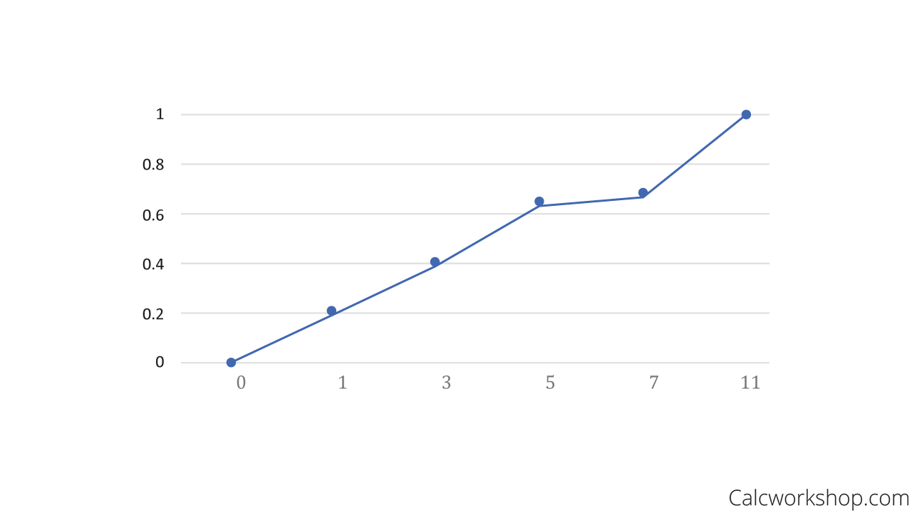
Ogive Graph Example
What you will notice about the Ogive graph is that if the distribution is skewed left, then the frequency values are less in the beginning and then increase rapidly, whereas a right skewed distribution produces an cumulative relative frequency graph where we see a rapid increase in values and then a tapering or tapering of frequencies.
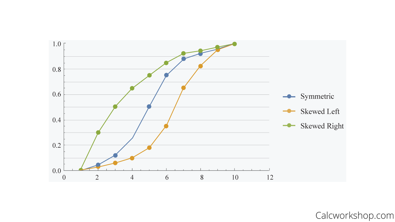
Skewness In Ogive Graph
How are cumulative relative frequency graphs useful?
They illustrate percentiles and indicate the shape of a distribution.
Percentiles
If you recall, the summary measure that divides a ranked data set (i.e., data placed in either ascending or descending order) into 100 equal parts is called a percentile. And percentiles indicate the percentage of observations a value is above.
For example, remember the box and whisker plot, where we display the first-quartile, median and third quartiles?
The 1st quartile tells us that 25% of the data is below this value, so it represents the 25th percentile. The median sometimes referred to as the 2nd quartile, tells us that 50% of the data is below this value, and it represents the 50th percentile. And quartile 3 tells us that 75% of the data falls below this value, representing the 75th percentile.
And as we will see in the video below, we can find, estimate, and interpret percentiles from a dataset when given an Ogive graph.
Shape Of Distribution
Did you know the line’s steepness in a cumulative relative frequency graph helps us determine the shape of a distribution?
And once we have determined the shape of a distribution, we can take this information and convert, or transform, observations using standard deviations to see how far specific observations are from the mean. This is called standardizing, and the most common form of standardization in statistics is the standard value, which is often called a z-value or z-score.
If we let x represent an observed value for the data, then we find a standard value by subtracting the mean from this observed value and dividing the difference by the standard deviation.
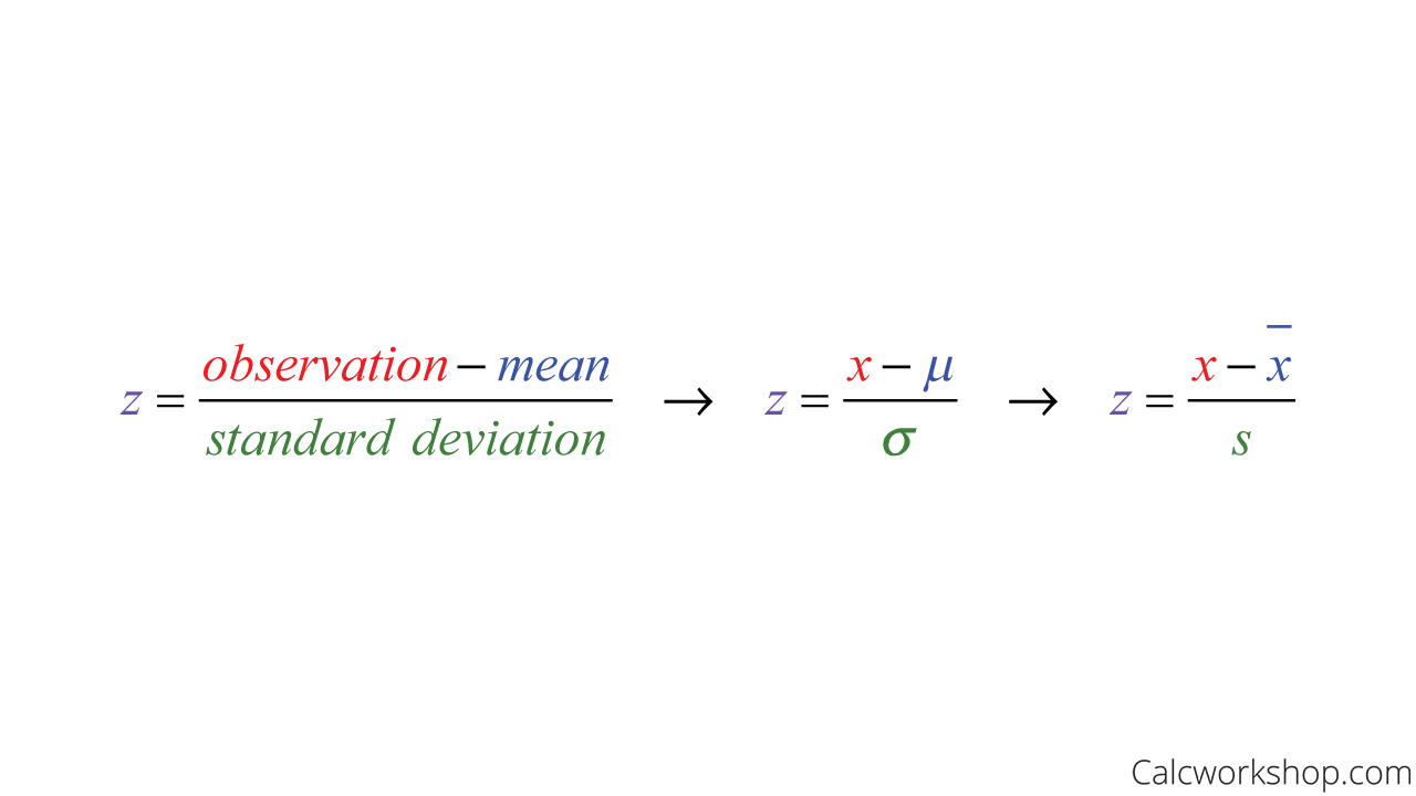
Standard Score Formula
By standardizing the dataset, we, in essence, are eliminating all units of measure; thus, allowing us to compare one observation to another even if they don’t have the same parameters (i.e., mean or standard deviation). Moreover, it gives us a sense of how likely or unlikely a specific value is to appear in the data.
How does standardizing help us determine the shape, center, and spread of a distribution?
Well, suppose we add or subtract a number to an observation. This will shift the center and location (mean, median, mode, quartiles, and percentiles) of the distribution that amount, but the shape and spread of the distribution (range, IQR, and standard deviation) will not change.
However, suppose we multiply a number to an observation. In that case, the center and location and spread (mean, median, mode, quartiles, percentiles, range, IQR, and standard deviation) will change in the distribution, and only the shape will stay unchanged.
Worked Example
For example, let’s say we had the following dataset: {10,14,20,22,26,27,31,35,40,41}. Let’s see what would happen to the center, spread, and shape of the distribution if we added a fixed number 10 to every observation.
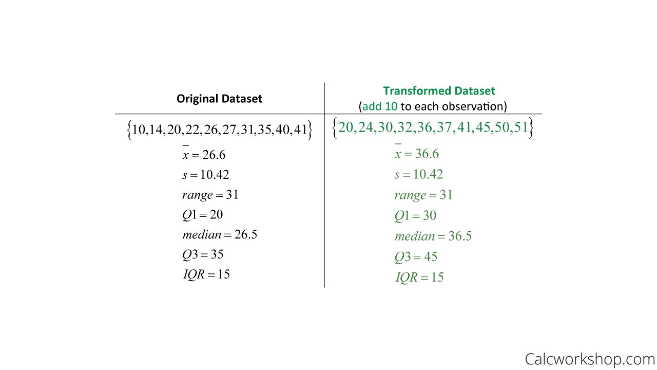
Transforming Data By Addition
Notice that the standard deviation, range, and IQR all stay the same, including the shape of the distribution, but everything else changed by a factor of 10.
And now, let’s take the same dataset and see what would happen to the center, spread, and shape of the distribution if we multiply each observation by a value of 10.
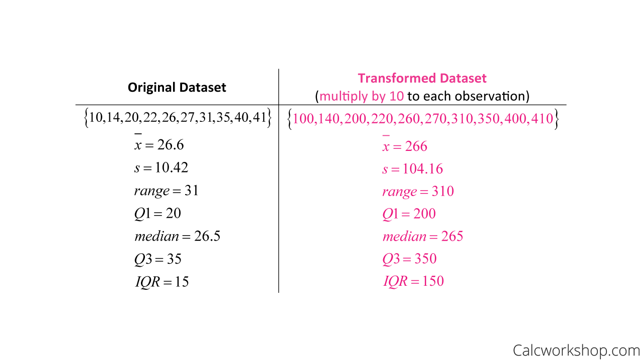
Transforming Data By Multiplication
This time, we can see that all summary statistics changed, and the only thing that stayed the same was the shape of the distribution.
Density Curves
And this leads us nicely to learning about density curves.
A density curve is always on or above the horizontal axis and has an area under the curve that equals 1.
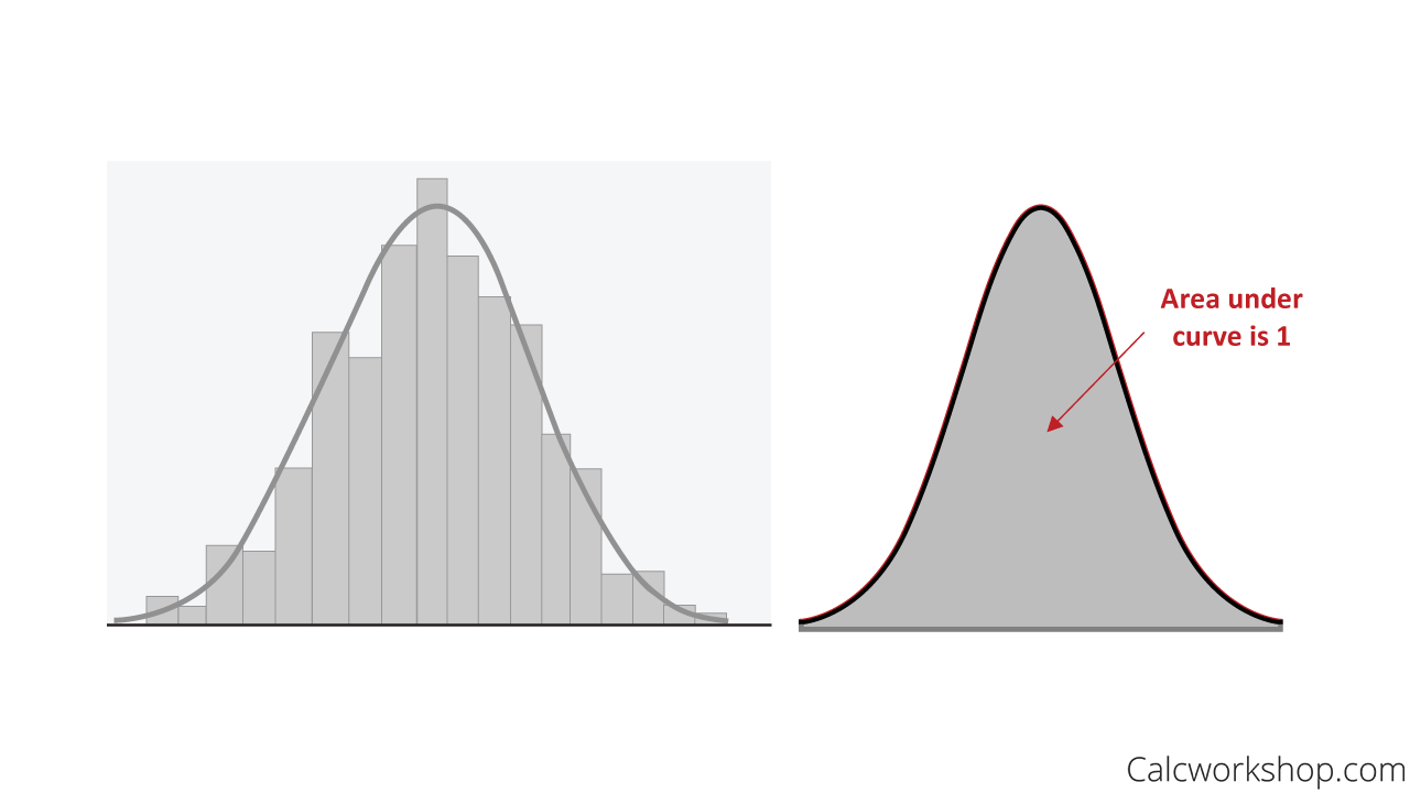
Density Curve With Area
Additionally, the density curve’s median is the “equal-area point” with half the area on either side, and the mean of the density curve is the balancing point (Think: Center of Mass).
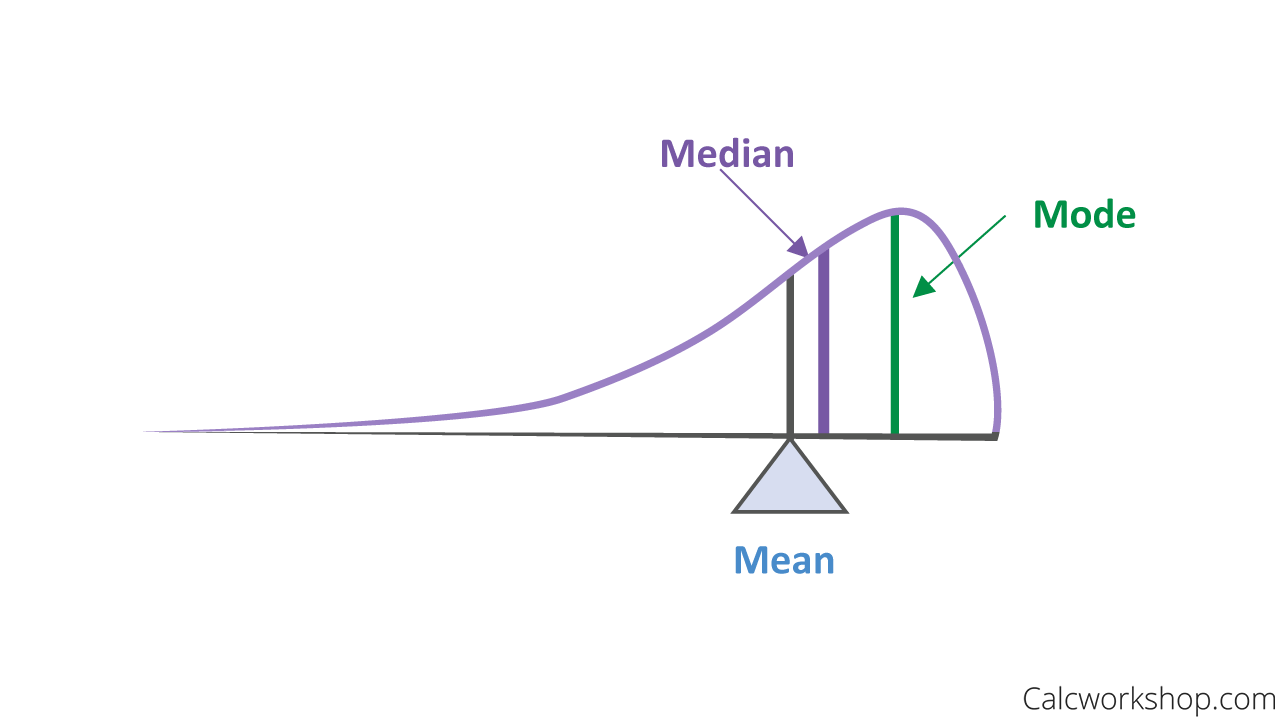
Location Of Median, Mean, And Mode On A Density Curve
Armed with this knowledge, we will be able to quickly determine where the mean and median are in a distribution and get us ready for finding probability!
This video is jammed packed with lots of valuable information about how we describe the locations of center and spread as well as the shape of a distribution, how we can transform data, find percentiles given a cumulative relative frequency curve, and begin our investigation of density curves.
Cumulative Frequency – Lesson & Examples (Video)
1 hr 03 min
- Introduction to Video: Describing Locations in Distributions
- 00:00:32 – What are percentiles and how to find them? (Examples #1-2)
- Exclusive Content for Members Only
- 00:05:57 – Overview of Cumulative Relative Frequency (Ogive) Graphs
- 00:08:01 – Create an Ogive Graph and interpret your results (Example #3)
- 00:19:21 – Understanding Cumulative Relative Frequency and Skewed Distributions
- 00:21:24 – How do we standardize distributions? Finding standard values (z-scores) for data
- 00:24:44 – Find the z-score or use the z-score to find the observed value (Examples #4-6)
- 00:36:42 – How do we transform datasets and what does it do to the center, spread and shape?
- 00:40:14 – What is a density curve? What are the properties of a density curve?
- 00:44:33 – Given a density curve, determine the location of the mean, median and mode (Examples #7-10)
- 00:48:34 – Given sample data find stemplot, percentiles, z-score, summary statistics, and transform data (Example #11)
- Practice Problems with Step-by-Step Solutions
- Chapter Tests with Video Solutions
Get access to all the courses and over 450 HD videos with your subscription
Monthly and Yearly Plans Available
Still wondering if CalcWorkshop is right for you?
Take a Tour and find out how a membership can take the struggle out of learning math.