What is categorical data?
Jenn, Founder Calcworkshop®, 15+ Years Experience (Licensed & Certified Teacher)
Great question!
That’s exactly what we’re going to cover in today’s statistic lesson.
You’re going to learn the differences between categorical and quantitative data, how to represent the data, and so much more.
Let’s get started!
The purpose of statistics is more than just collecting and organizing data. It is about analyzing and displaying information coherently so others can:
- Observe patterns.
- Determine relationships.
- Draw inferences or conclusions about what is seen.
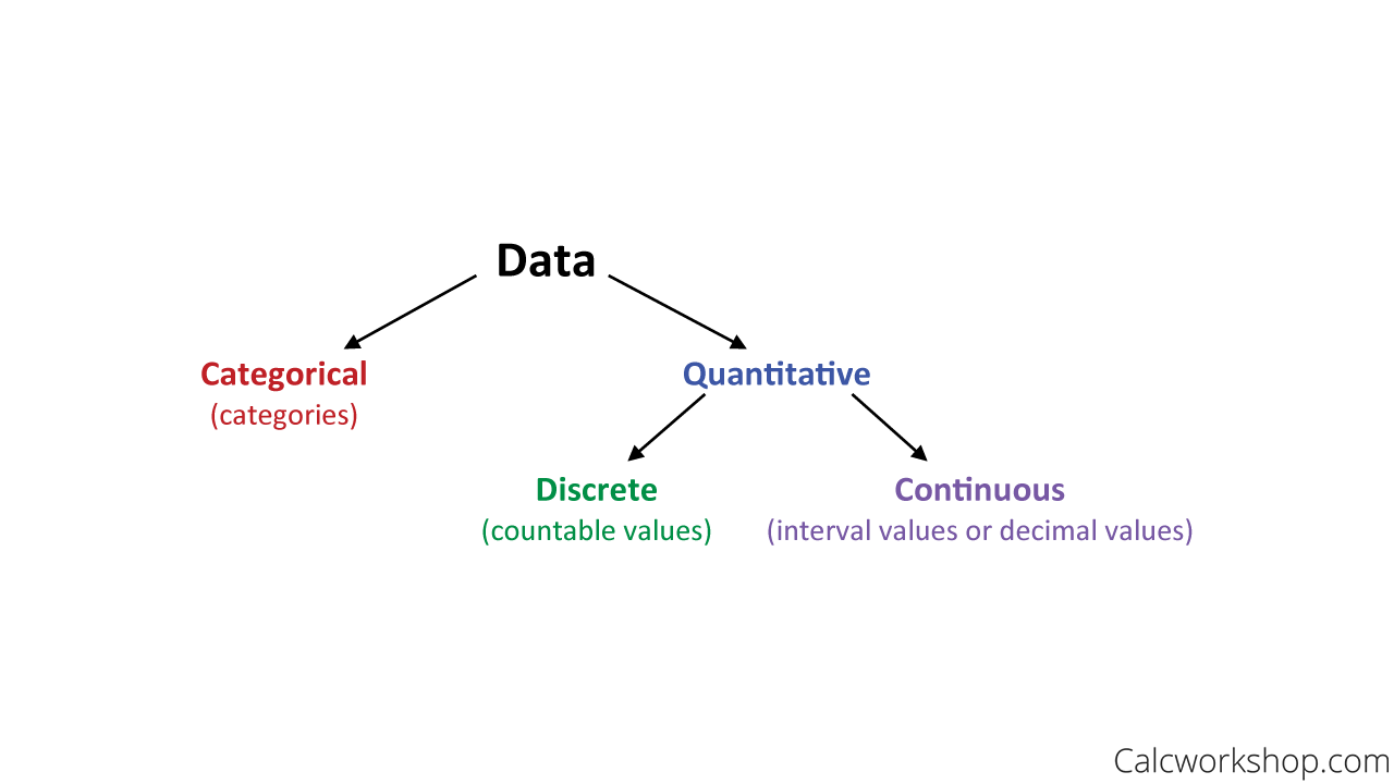
Data are the measurable or observable characteristics of a group of objects or people collected and classified by the type of value or variables that it represents.
There are two major types of data:
- Categorical Data
- Quantitative Data
Categorical Vs Quantitative Data
Categorical Data
Categorical Data, sometimes called qualitative data, are data whose values describe some characteristic or category.
For example, a survey could ask a random group of people:
- What is your lucky day of the week?
- What is your favorite color?
- What is your favorite boy’s name?
- What is your clothing style, gender, type of residence, or education level?
Quantitative Data
Quantitative data are data that take on numerical values. In fact, quantitative data is sometimes referred to as numerical data, as it is expressed in numbers. A great way to help distinguish between categorical variables and numerical variables is to ask whether it is measurable or not. If the data can only be grouped into categories, then it is considered a categorical variable. If, however, if you can perform arithmetic operations then it is considered a numerical or quantitative variable.
For example, a random group of people could be surveyed:
- To determine their grade point average.
- The amount of time they work in a week.
- It can represent the brightness of light.
- The size of a home.
- An object’s height, age, or weight.
And there are two critical characteristics of quantitative data that help us to further classify observations: discrete quantitative data versus continuous quantitative data.
Discrete Data
Discrete data are countable measurements or a listable set of values, such as:
- The results of a roll of dice.
- The number of characters typed per minute.
- The number of goals scored in soccer in an entire season.
- The number of baseball cards in the collection.
Continuous Data
Whereas, continuous data represents interval values or decimals, such as:
- Weight.
- Height.
- Blood sugar level.
- The length of it takes to run a race.
Additionally, we can also classify data by the number of variables that are represented. If data describes a single characteristic of a population, we call this univariate (one-variable) data. Bivariate (two-variable) data describes two characteristics for each subject, like is we want to know the number of pets and then the number of siblings each person. And multivariate (many-variable) data describes multiple characteristics of each subject in the population.
Descriptive Statistics
Now it is essential to point out that it is doubtful that you will be able to collect data from every person or object in a population. Therefore, we rely on a sample to help us understand the population as a whole. In doing so, we can summarize our findings using graphs or charts or find averages and percentages. These are called descriptive statistics, and together they help us create what is called a distribution function, which is a curve that shows the possible values for a variable and how often they occur.
How do we do this?
How do we represent and display data?
One-Variable
Let’s focus on how to present categorical data for one-variable.
Categorical data is best displayed in a frequency table, relative frequency table, cumulative frequency table, pie chart, or bar graphs.
Let’s look at an example for each.
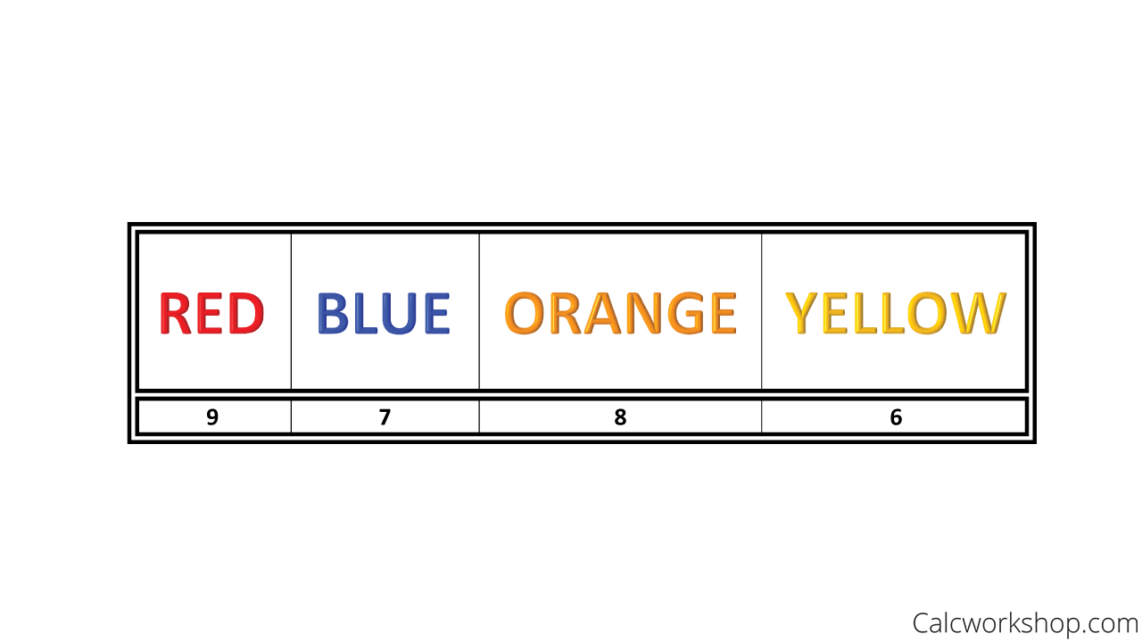
Suppose we ask 30 people to choose their favorite color: Red, Blue, Orange, or Yellow.
The selections are made, and we count up the results as follows:
Frequency Table — Example
Note that the four types of colors that these 30 individuals are choosing from are considered categorical variables.
Additionally, the counts are called the frequency, and they tell us how many people chose that particular color. The table above is called a frequency table.
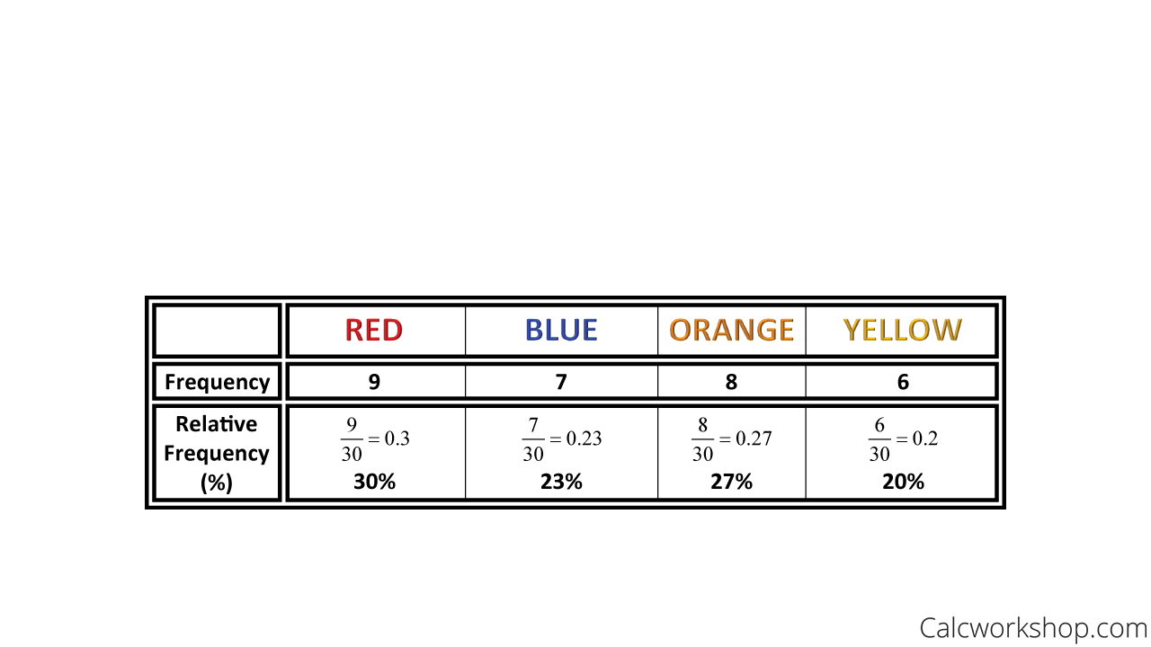
But suppose we also want to find the percentage of the people sampled who chose a particular color. The first thing we would have to do is to convert each count (frequency) into a percent (relative frequency), as shown below.
Example of Relative Frequency
Notice that if we added all the percents together, it would sum to 100%.
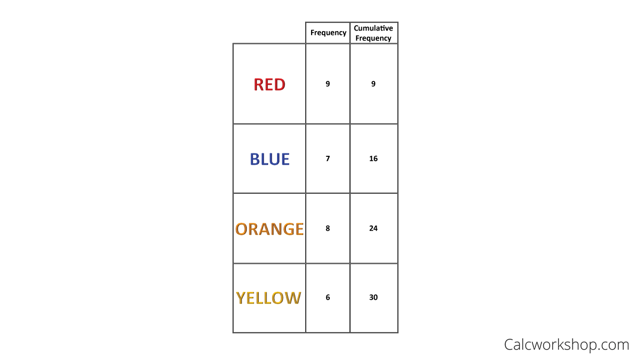
We can also create a cumulative table, which is nothing more than a running total of the frequency counts.
Example of Cumulative Frequency Table
- So the first count is for Red, which is 9.
- Then the next cumulative count would be the sum of Red and Blue, which is 9 + 7 = 16.
- Our third cumulative frequency would be the total of Red, Blue, and Orange, which is 9 + 7 + 8 = 24.
And our final cumulative frequency would be the total of a frequency distribution, which is the sum of all four colors for a total of 30, the total number of people sampled.
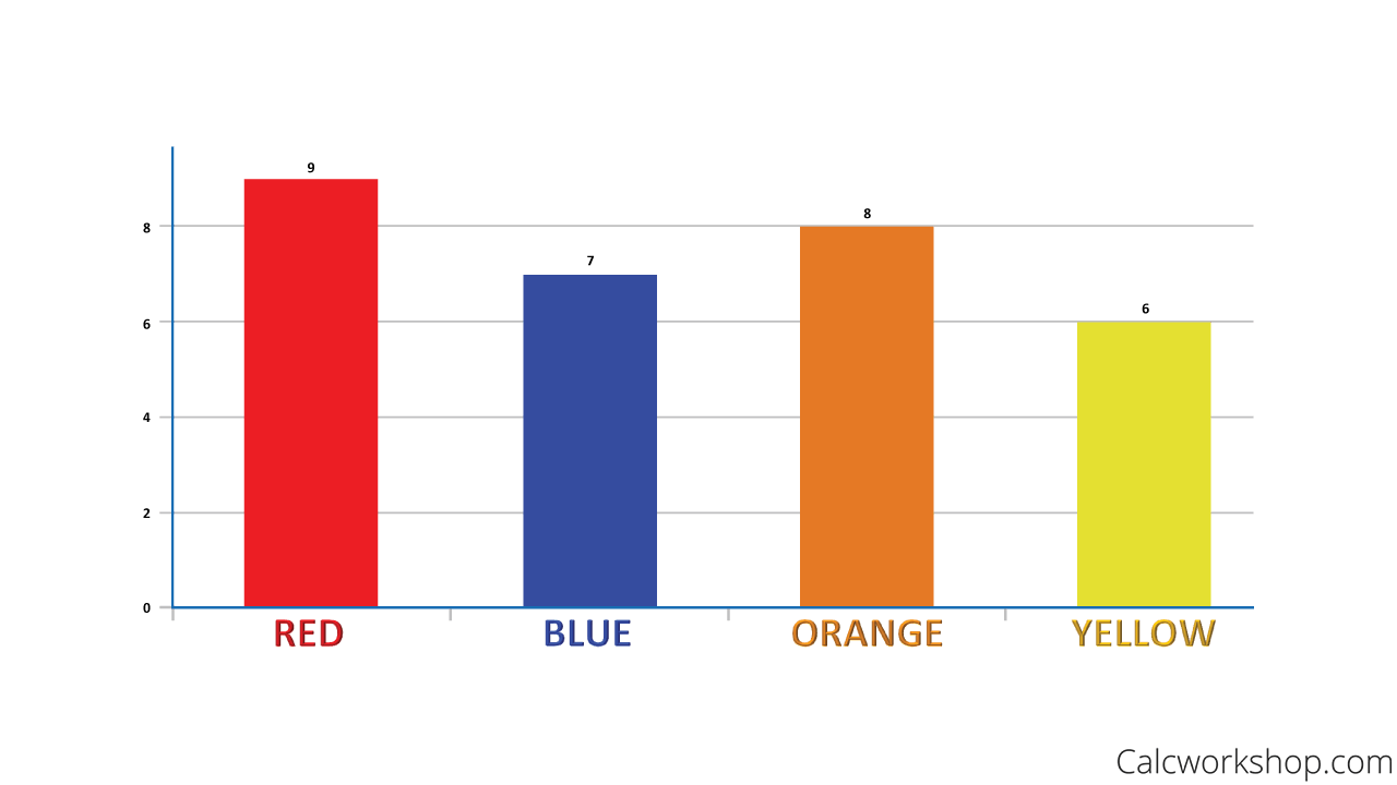
Next, we can display these frequencies (counts) in a bar chart, sometimes called a bar graph.
Bar Graph — Example
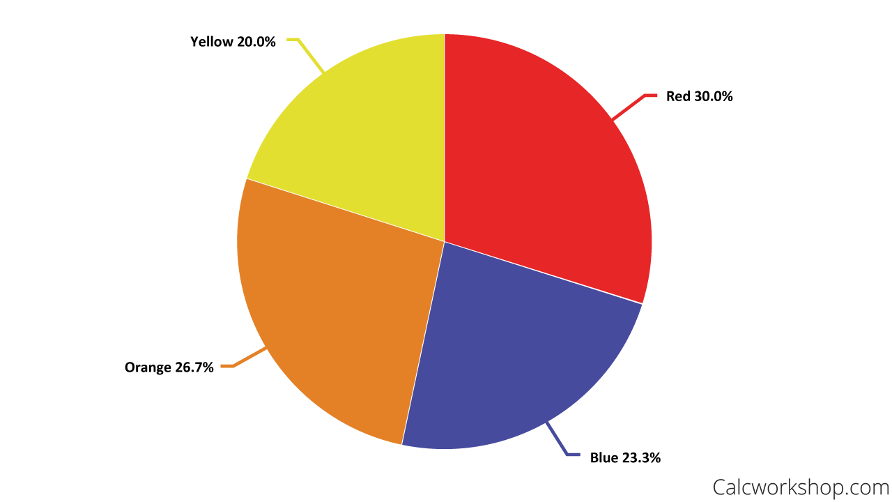
And, we can present our relative frequencies (percentages) in a pie chart or pie graph.
Pie Chart — Example
Two-Variable
This example nicely describes the different ways we can classify and display a categorical variable.
Now, let’s discuss how we can display data for bivariate (two-variable) data.
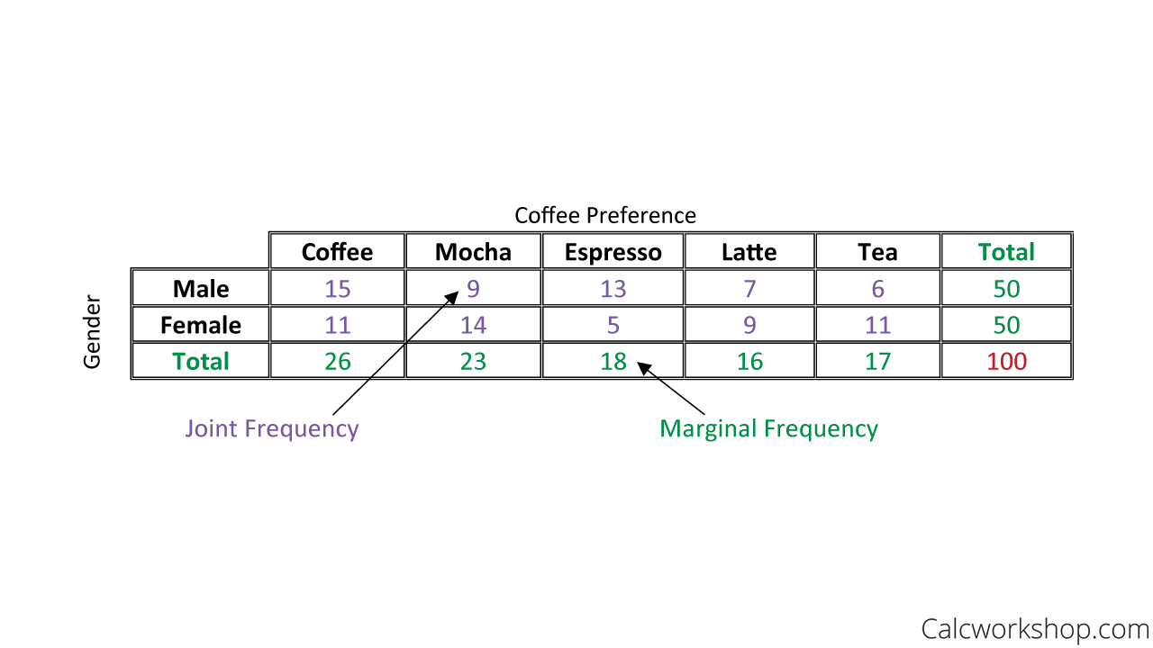
Two-way tables, sometimes called contingency tables, help us to organize a dataset involving two categorical variables.
For example, imagine we wanted to determine coffee preferences for males and females. A random sample of 50 males and 50 females yielded the following results:
Two Way Table Example
The numbers we see inside the table are called the joint frequency counts and the column and row totals are called the marginals, or the marginal frequencies because they are found in the “margin” of the table also noted by Yale University.
And notice, the total number of people sampled is 100, which accounts for 50 males and 50 females.
And from here, we can start to ask questions like, what percent of males drink espresso? Or how many people drink tea?
So, together we are going to look at countless examples of how to find, organize and display univariate data in the form of tables and charts and graphs, as well as interpreting bivariate data using two-way tables.
Let’s do it!
Categorical Data – Lesson & Examples (Video)
1 hr 22 min
- Introduction to Video: Understanding Data
- 00:00:33 – Overview of Statistics, Element, Variable, Data, Inference, and Descriptive Stat
- Exclusive Content for Members Only
- 00:09:40 – Types of Data: Categorical, Quantitative Discrete, and Quantitative Continuous
- 00:13:51 – Identify the type of data presented (Problems #1-10)
- 00:18:41 – Understanding data distribution and how to display categorical data
- 00:22:51 – Given exam scores create a frequency table, relative frequency table, and cumulative frequency table (Problem #11a-c)
- 00:30:00 – Given exam scores create a pie chart and bar graph (Problem #11d-e)
- 00:34:52 – Overview of Contingency tables, join frequency, marginal frequency and marginal and conditional distribution
- 00:45:23 – Given two-way table find totals, relative frequency, and marginal frequencies (Problem #12a-e)
- 00:58:27 – Given two-way table find conditional distribution tables (Problem #12f)
- 01:06:57 – Given contingency table find relative and marginal frequencies and side-by-side bar graph comparing the data (Problem #13)
- Practice Problems with Step-by-Step Solutions
- Chapter Tests with Video Solutions
Get access to all the courses and over 450 HD videos with your subscription
Monthly and Yearly Plans Available
Still wondering if CalcWorkshop is right for you?
Take a Tour and find out how a membership can take the struggle out of learning math.